Iteractive media and game arts
Tuesday 28 September 2010
Monday 27 September 2010
Drawing tablet
Throughout this project I have been using a digital drawing tablet (Bamboo fun), I use this because it give me more control then using the mouse and it also has pen pressure. I have been using my tablet for around 1 and a half years and I can controll it really well by now.
Evaluation
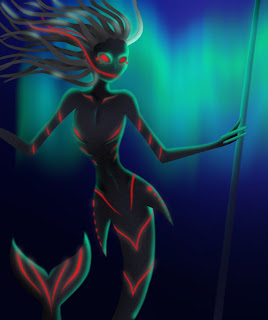
All in all I am very happy with my end result and how I got there, I believe I used the most appropriate tools that I know of to create my image. I was able to do this because of my previous experiences with Photoshop and new tools were shown to me through the various demo's I have taken part in. I also like my idea and I think that it links back to the theme of 'underwater life' really well and is original. I really love how the glow came out and I think the overall image works really well. The only thing I don't really like about my image is the fingers because they lust look like sausages, this could be improved by making them thicker at the knuckle and maybe curving them.
Bubbles
I blurred the bubbles by around 3 px becaus they were too hard in contrast with the rest of the picture.
Thursday 23 September 2010
Glow effect
I got a better glow effect by copying the red glow layer five times and blurring the layer mask more and more each time.
Wednesday 22 September 2010
My final image
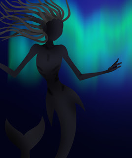
 To start off my final image I started with a quick sketch in photoshop of the creature, just using the brush tool.
I then added a dark blue background and inversed the colours of the sketch so I could see it. I then started work on the Auroura on the background. First I had to draw a line of light blue then a line of turquoise. I then used the smudge tool to make the lines wavy and different thicknesses, I then went into blur > motion blur and set the angle to vertical. This got me a great auroura effect.
 Then using the pen tool I made the body shape on one layer, the head, tail and fingers on another and the ear on a layer on top. I did this so that the staff could go between her and and fingers and so that the hair can overlap the forhead and not the ear. I then used the burn tool to make the shadows.
For the hair I used the pen tool agian to make the shapes and made tendrils on five different layers then shaded with the burn tool.
Next I made the highlights by making a new layer and filling it with light turquoise, I then added a layer mask and inveresed it so all the layer was hidden. I then started painting on the highlights. This took a really long time to get these all right and in the end I had four different highlight layers.
After the body highlights were finished I used the same process on the hair but with a lighter colour. I also duplicated all the body layer and added txtures to them, then set the opcity of the txured version to 5%
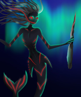
Next I added the glowing red using the same method as the highlights. I also added the eyes which were originally black but I decied that didnt work and added the red on top, keeping the black there to make the eyes seem sunken.
I then duplicated the red glow layer, changed it to a lighter red and then blurred the layer mask to get this glow effect. I also added a second ear behind the hair layers.

Next I tried to make a sharp pionted stick for her to hold by making the baisc shape using the freedom pen tool with my tablet pen in my right hand (I'm left handed). I then went into Filter > Render > Fibers to give it texture. I then used the freedom pen tool again to make a selection for the shadows on the rock by adding a levles adjustment layer, I then did the same for the highlights. I also added a layer filled with dark red for the blood and made a layer mask in the same way I did for the highlights.

I then decided this didn't work so I went back to my origanal idea of a staff. The highlight was done in the same way as the bodys highlights and I used the burn tool for the shadows.
Next I made a custom brush called 'bubbles' by making a new file and by using a large hard brush to make a circle. I then used a smaller size soft rubber to rub out the inside and went into edit > define brush preset to make it a brush. When back in my document I changed the brushes settings around, putting the spacing up as well as checking shape dynamics (sixe jitter at 80%) and scatter (scatter at 330%). After drawing the bubbles I used the dodge tool to highlight the bits of the bubbles nearest to the auroura and darkened the bubbles farest away from it.
Finally I added a layer filled with dark blue on top of all the layers and set it to Overlay at 40%. I then added a levels adjustment layer to brighten up the highlights and darken the shadows.
Typography
Today we talked about typography and looked at the three main catogarys, serif, sans serif ans script. Serifs are the small flicks and curls at the end of letter in a font, therefore sans serif (sans in french means without) is a font without those fliacks. Script looks more fancy the both and resemblkes writing.
We then experimented on photoshop and using the window 'character' we played around with the spacing between the letters and the spacing between the lines.
We then experimented on photoshop and using the window 'character' we played around with the spacing between the letters and the spacing between the lines.
Subscribe to:
Posts (Atom)


